Problem Discovery
As a project, it wasn't so much of a UX problem (that responsibility is mostly on Wefunder's side) as it was just a graphic design challenge. The original images for the campaign were taken directly from a pitch deck that the founder, Tyler, was using to pitch directly to VC's. While I have definitely seen worse slides, they still needed a bit of TLC.
The Solution
I started with the basics. When it comes to presentations, everyone (myself included) has violated this one simple rule:
One idea per slide.
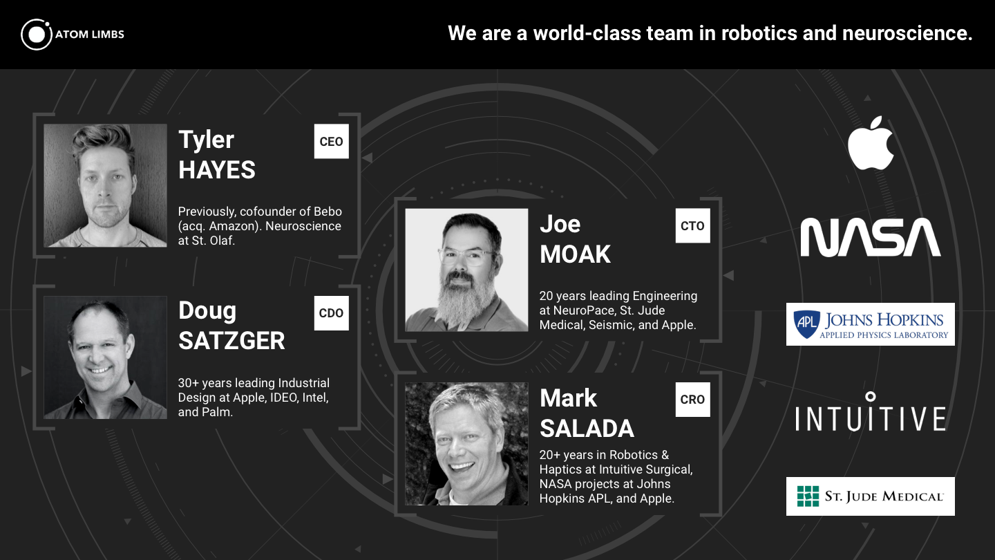
Because the original graphics came from a slide deck, they had many bulleted lists of different kinds of things which clouded the goal of the images. A presentation and documentation are 2 different kinds of deliverables that serve 2 different purposes. Usually, when you see slide presentations with lots of bullet points per slide is because someone is using a presentation as a form of documentation.
Sometimes this is ok, like if you're sending the deck to someone else as a document to read later. But if you're giving a presentation, it is far more effective to stick to the "one idea per slide" rule, and just add more slides.
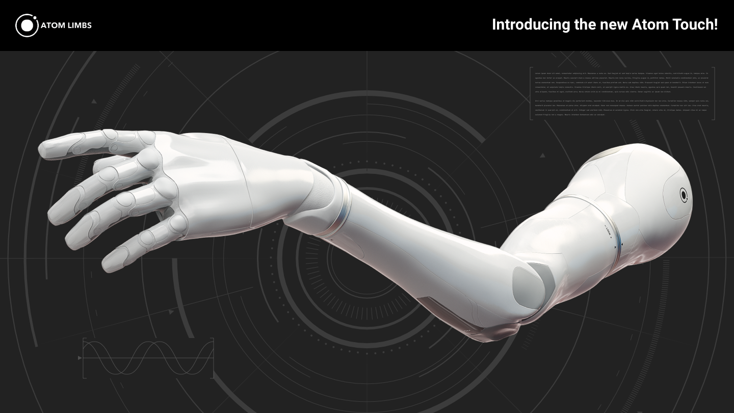
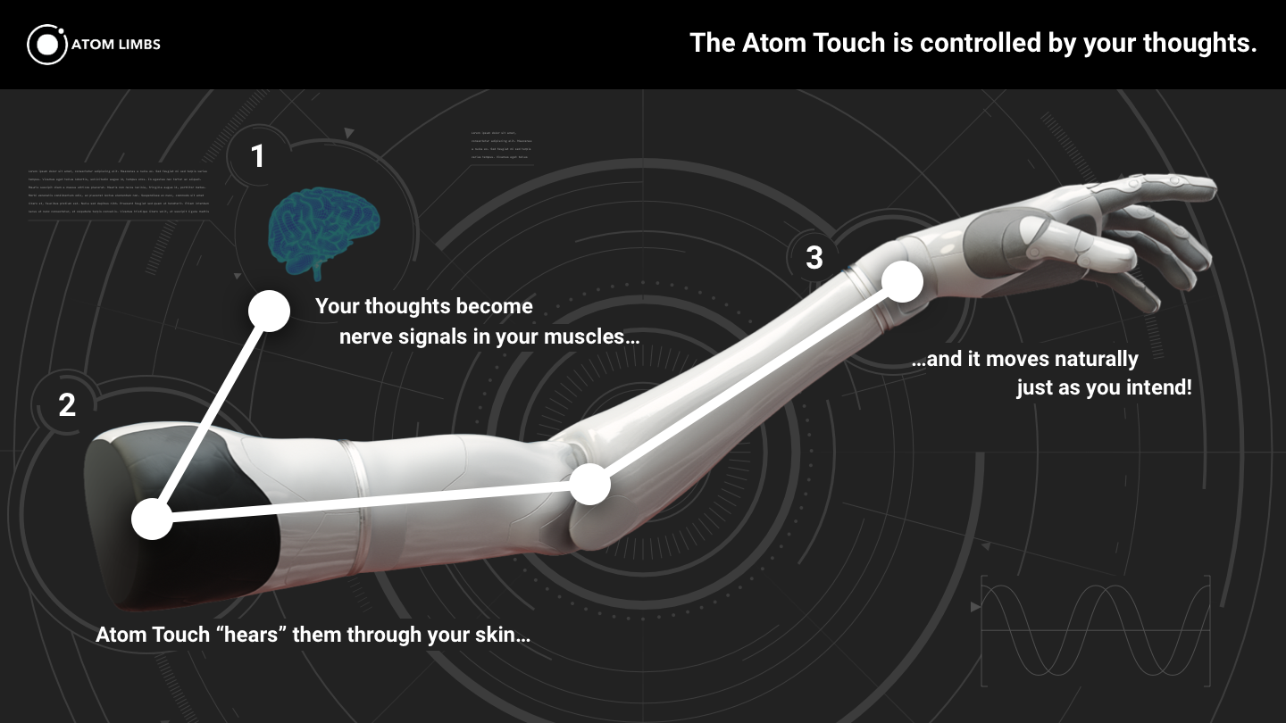
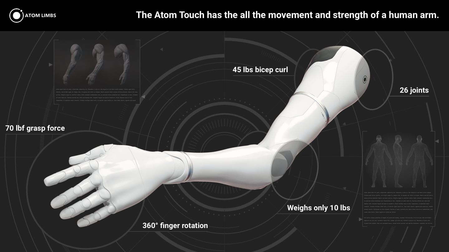
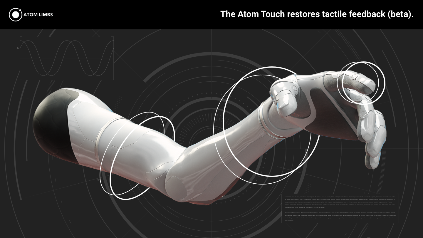
In this case, since these were to be used for raising funds for the company, I classified these as presentation materials, and so focusing each image on one idea was the most important part.
Borrowing inspiration from science fiction, I created a graphic language that related to futuristic technology. It was still important to not make it seem totally far-off and fake because this is real technology, a real product for people with real challenges. So it was important to find a balance between completely fictitious-looking and actual tech.
The Outcome
Atom Limbs raised a huge seed round out of their Wefunder campaign. Since the campaign was not run as an A/B test (it wasn't needed), it's difficult to compare the impact of one presentation style with the other. Regardless, it was still important to do this work to help Atom Limbs achieve success.
If there is anything I would consider changing, it would be to explore more variety in terms of color palettes and using colors to establish a stronger brand presence. The current branding for Atom Limbs is rather austere, and so this look fits in with how the company is currently branded. Taking on a strategic rebrand would have also delayed this work as well, so it was out of scope for what I needed to get done. Regardless, Atom Limbs had a great outcome from the campaign!