The Customer
Quibb built up a strong community of prominent tech workers, startup founders, and startup investors. The community would share new links of what they were reading every day. Everyone at Quibb was very knowledgeable about technology, and tech products. The Quibb community shared what they're reading in order to spread knowledge and help others grow (either personally or professionally).
The original version of the mobile app was built a while back and was based on the then-current version of the Quibb website. But as the website expanded in features and functions, the app lagged behind because it didn't get the latest features.
Problem Discovery
How might we establish feature parity between mobile app and the website?
Quibb is sort of like a professional Reddit, a link sharing site full of intelligent people. I was fortunate to get access to Quibb, and I used it quite a lot to learn many different things. But when I was away from my computer, I found that the mobile app worked slightly differently from the website. When I talked with Sandi (the founder of Quibb) about the app, I learned that this product divergence was more the result of being small and scrappy, and needing to focus rather than getting spread too thin. So I decided to work on this myself.
The Concept
For this mini side project, I didn't go into a significant process to research and develop the concept. It all started as a way to satisfy my curiosity about bringing some feature parity to the mobile app from the main product. From there, I mostly just started working in Sketch (as opposed to sketching).
In retrospect, working with the Quibb community to develop the ideas more would've been a good idea. Hindsight is, as they say, 20/20.
-
Quibb worked like many other link sharing sites. The advantage Quibb had was a carefully curated community.
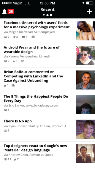
For the main screen, the idea was to give users access to the main tabs in Quibb. When I do use the site, I prefer seeing the “All” tab, the part of the site that shows all the content posted by Quibb members. But after talking with Sandi MacPherson, Quibb’s founder, there were many more use cases to account for beyond my own.
Quibb is known for having a very austere visual presentation. Mainly black and white with almost no use of color. Here, I stayed consistent with the minimal color palette. I changed the app header to allow for the ability to change categories. As the user swipes left, they can see the other categories on the website, “Popular”, and “All”. Also, by moving the member portraits to the right, there is a greater feeling of emphasis on the news stories themselves, as opposed to the person that shared it.
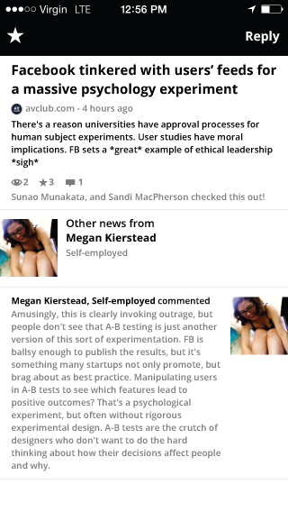
Once the user taps an article, the page pans to the left and reveals the article beneath the main screen. As with the prior page, moving the member information below the article keeps the focus on content. The main controls for this page are vastly simplified to just likes and replying with comments. To go back, the user drags to the right to pull the main screen back from the left side of the screen.
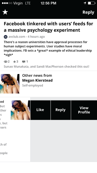
To interact with comments, the user drags the comment to the left revealing additional controls for “Like”, “Reply”, and “View Profile”. Drag the comment to the right or just tap the comment to close.
Tapping the headline of the article will slide the detail page to the left and open the article. The Quibb toolbar is still there, allowing users to either go back to the previous page, or open the article in the user’s default browser. The icons here, are simplified and adhere to Quibb’s minimalist style.
The Result
While these mockups weren’t directly what the app has become, they did help form the basis for the new design of the Quibb app. I met up with Sandi a few more times to discuss changes and provide feedback on the app design, and eventually a new app was released! …and I even got a couple of shoutouts!
All told, while it would have been nice to have seen my version of the design come to fruition, helping influence the direction of the new product was still a great experience!
It was cool though, that Sandi eventually did put together a new iOS app for Quibb, no doubt as a result of some of the ideas I put together. Sadly, Quibb has ended up in the graveyard of past startups and obviously the iOS app is no more. But it was a great little side project and I'm happy to have influenced the direction of one of my favorite tech products.