
The Customer
Alexa Internet has been a tool used by site owners, online marketers, and webmasters for many, many years. As one of the early web analytics products, people have used Alexa's panel-based, web rankings to understand how popular their site is, in the hopes of being able to get more traffic.
These kinds of customers are trying to grow their online businesses, not just in terms of revenues, but also reach.
Understanding analytical data can be daunting for the novice. I heard time and again that Google was too complicated for people to understand. In addition, once they do figure out what's happening on their site, it can be just as difficult to understand what to do with that information. People know that they need the information, but it's difficult to make heads or tails of it, in a way that's actionable.
Problem Discovery
Google Analytics is the most commonly used tool for collecting web traffic data. No doubt it is a powerful tool, often used by experts, but that leaves a lot of non-experts wanting. There are a segment of people looking to create online businesses, but need easier tools to help them understand what's happening on their sites!
The Solution
User data was very scarce. There was a lot of inferred information based on the past usage of the Alexa website, but these inferences would not help us design a new data product for a new age of the Internet. So the first order of business was to start establishing a user-centered design discipline to help us focus on the right things.
-
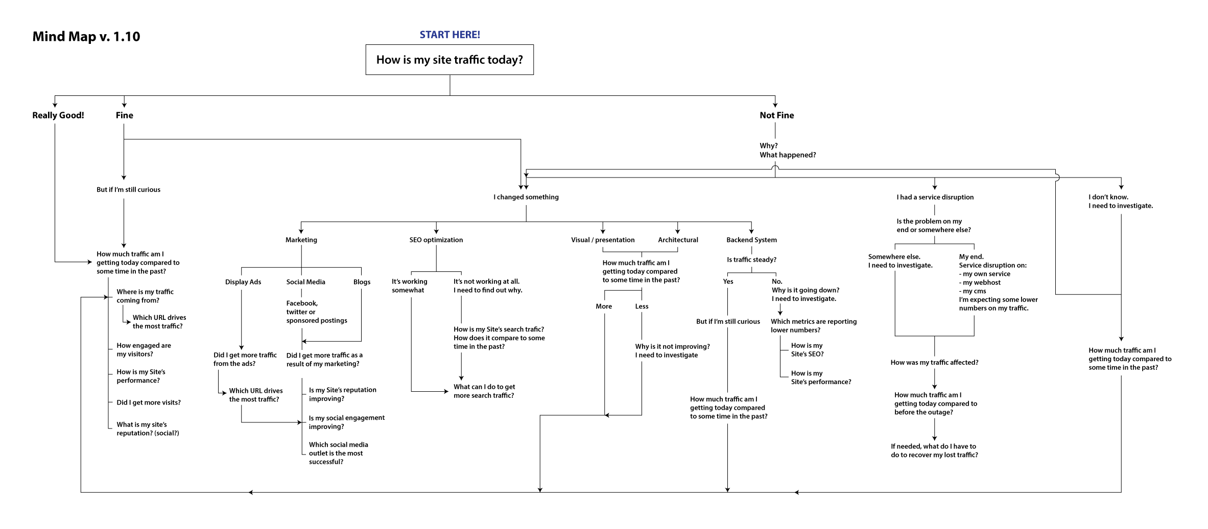
This diagram maps out the mental model for using web traffic data.
I started the design process by mapping out how site owners use analytical data to take action. We needed this to established a shared understanding of what we would need to do with the product. This work was based on a lot of internal discussions and also some customer interviews to ensure that it highlighted the right things.
-
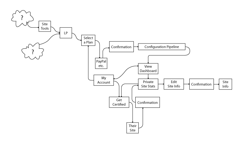
The proposed information architecture of a new system.
Based on what we learned from the initial mapping, I then started mapping product flows. There were lot of different concepts and pages to keep organized to make sure that users could get value from the product.

-
The data itself is interconnected in different ways. No data point is an island!
In another phase of the project, I also mapped out how a given data point within the system connected to other data points. To understand what the data is saying, these analytics are best understood when used in comparison. There is never really a time when a single data point is used in isolation. By mapping these connections, it helped give the team a sense of how complex web analytics can be, and how much we would need to do to help simplify the experience.
Designing Information Systems

-
An early wireframe for the new dashboard. The web traffic performance is summarized by the spark lines in the first panel.
This is the first wireframe created for the main dashboard page. Typically, a dashboard page should be focused on summarizing metrics in a simple yet compelling way. But our customers might be managing multiple different sites and products. So the page morphed into more of an access point to many different kinds of content as opposed to just an information dashboard page.
-
After selecting a website, they can get into all the data.
After selecting a website on their main dashboard, the user would be taken to a metrics page for that site. This page would summarize the critical metrics for that site to give them the "big picture".
This "drill down" interaction model was critical in establishing the kind of investigative behavior to help people understand how to use the system to get insights about their traffic.
-
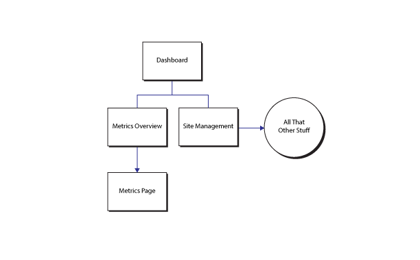
This IA, while not comprehensive, helped define a simple structure for how to make data more usable.
Based on the early concepts, I created a variety of wireframe prototypes and conducted some usability tests to evaluate the new designs. As a result, we eventually settled on this drastically simplified content architecture for the system and continued iterating on the UI.
Further Iterations

-
Getting more detailed the further we go.
Continuing on the “dashboard as access point” requirement, I iterated further on the features of the dashboard. One feature that I added was the notification system to alert users of the system to important events with either their site traffic, or features to help them manage the system.
-
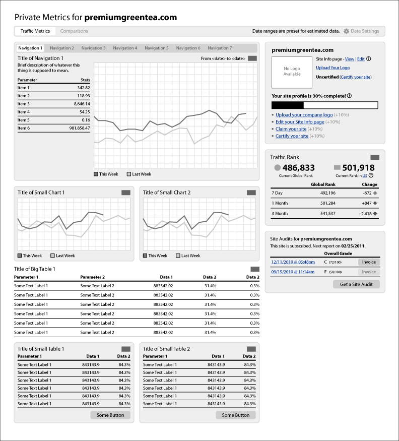
Different kinds of charts for different kinds of data.
I also continued to iterate on the wireframes for the metrics overview. A single data point on its own has very little value. So an important aspect of the conceptualization of these screens was to always show information in comparison to something, either to another data point, or to itself from a previous time period.
-
Another wireframe concept for presenting information on the metrics overview. It includes some navigation elements.
In this concept, rather than having panels for each metric comparison, the user could browse the main tabs across the top of the main panel.
One important concept behind these wireframes was to try to make the data interactive. It doesn’t come across very well in a static wireframe, but the idea was that the charts were not just static images, but interactive elements also. A user could click on any point on the line to then drill down even further to very specific information display about that data point.
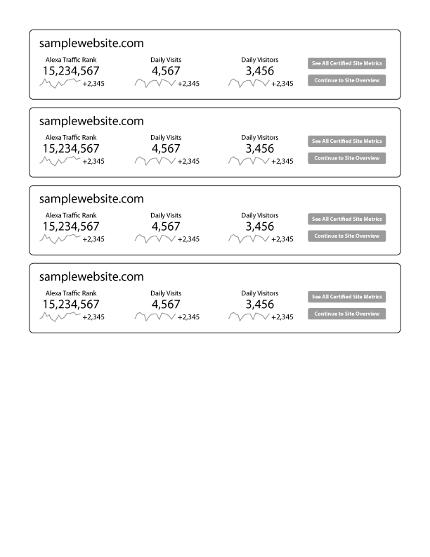
Instead of a data table that lists all sites you own, I developed a concept for using specific panels that summarize information for your site. The panel was intended to provide more of the key metrics up front, as opposed to always having to click through to the subsequent metrics page.
Visual Designs
While the concept continued to evolve, I had my team members work on the visual design for the product. I established and managed a small design team to handle a variety of different design tasks and this was the first major project for us.

-
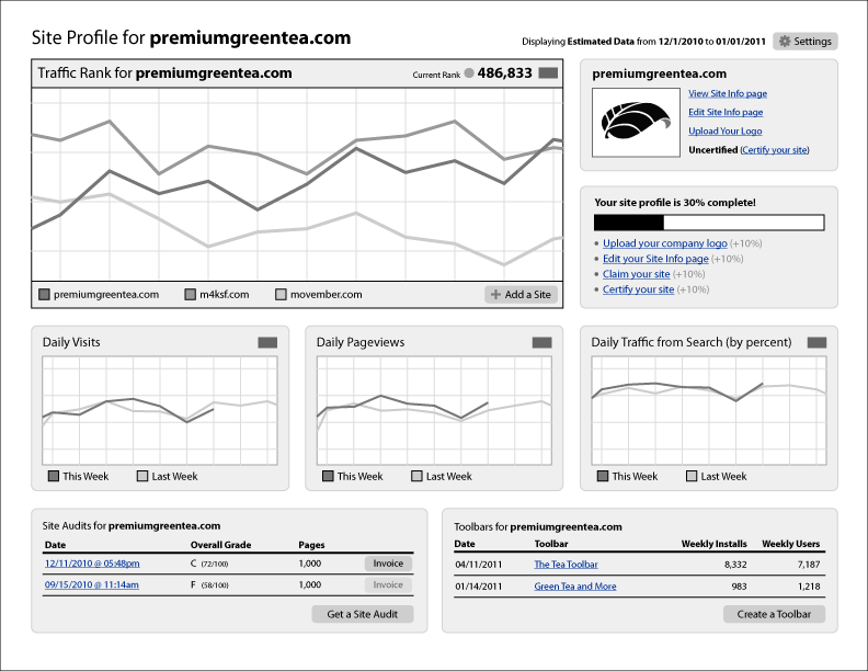
This page is intended to provide the big overview of all the different metrics that affect all the different sites that they are managing.

-
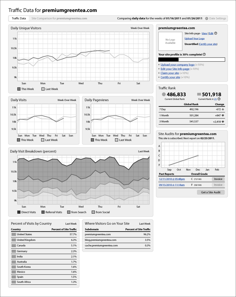
As they dig deeper, they can see more metrics that affect a specific site.
We went through various iterations and even more usability testing. These mockups here are the end result of all that work.
The idea was to have a more stylish but simple take on web traffic data. Scrolling up and down the big metrics page helped people compare data points and get a real understanding of what was happening on the site. Even though the page was quite long, testing showed that it didn't matter since people were mostly engaged with trying to learn something.
The Outcome
We had successfully completed a lot of UX work in a short amount of time. We did multiple rounds of user testing, iterated on designs, and completed a visual rendering of all the wireframes. Despite achieving our design goals, it was decided late in the process to launch with a significantly reduced feature set, which was unfortunate since those kinds of changes can have a negative impact on the user experience of a product. In scenarios like these, it is critical to keep focus and quickly follow up with additional product iterations to both react to feedback and integrate the features that were left out. Your users will greatly benefit from it!