The Customer
With ERP systems, there were many different roles to consider. I spent time with our business analyst and product managers to discuss these various roles to understand what kinds of responsibilities they had, to help start the ideation process. Since I can't share the official personas that we were using, here's just a summary:
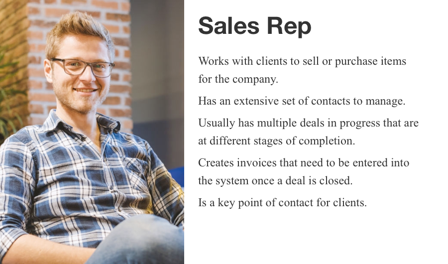
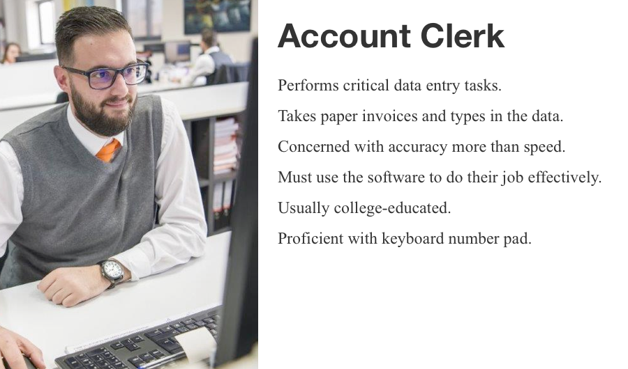
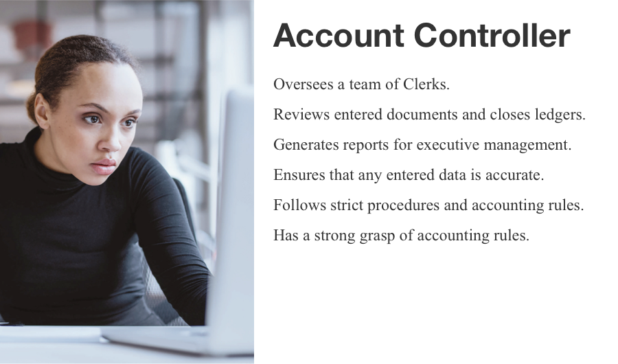
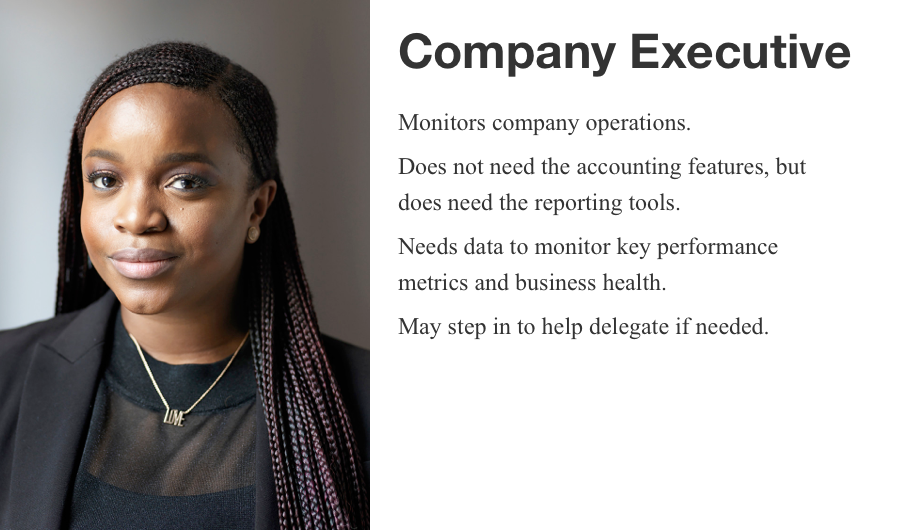
Each role had different needs and functions, and it was important to pull it all together under one holistic product.
The Problem
How might we modernize an aging desktop application to better meet the needs of the end users with modern software?
How would the product surface the right information at the right time? How should we improve on the product's long legacy? The original desktop product was created decades ago as a basic MS-DOS utility (think command line functions) and over the years evolved into a complex, Windows-GUI application. With the move to modernize it from an on-prem installation to a cloud backend, I lead a team of designers to redesign the user experience for the next generation.
The Solution
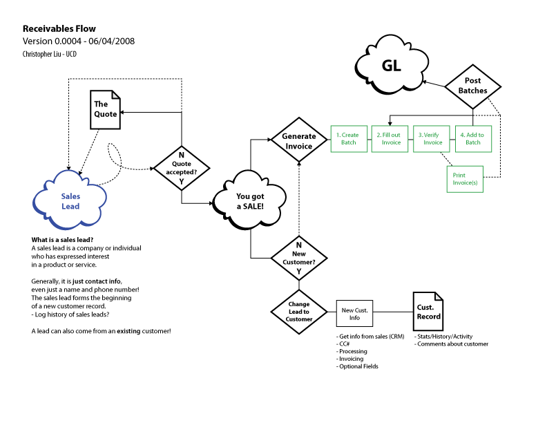
I started things off by meeting with product managers and business analysts to begin learning about how the product works, how accounting is done, and learn about the customer. I translated those learnings into a general user flow that maps out the entire process from sales to accounts, and finally to the general ledger (GL) so that we would all know how everything fits together. This map served as the foundation for the work that was to come.
-
I created many flow charts like this to document how the system functions. In this case, it shows how information moves from a sales lead to a closed account ledger. Flow charts and information architecture diagrams like this are incredibly helpful documents for framing a design.
In looking at this more, it became clear that the accounting clerk would be a good role to focus on to start the process of redesigning the application. After all, the system can't work without the accounting data, and the data entry clerks fulfill that crucial task. So the next step was to rethink the invoice entry screen, the UI that clerks use to input the data.
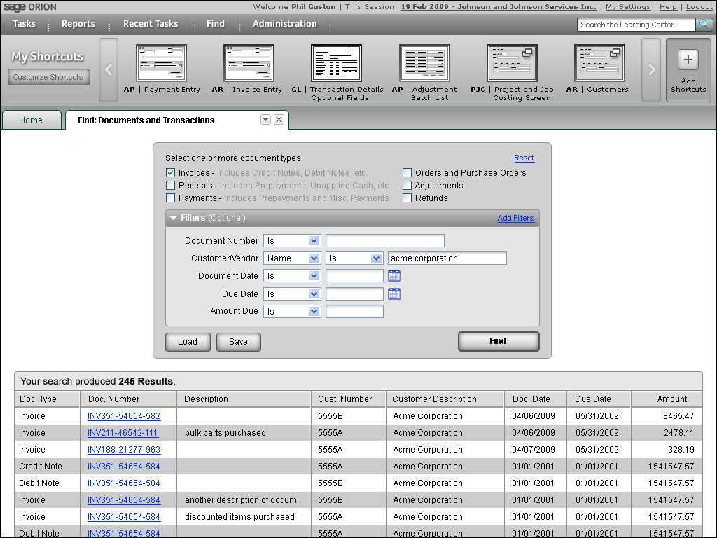
Supporting Data Entry
-
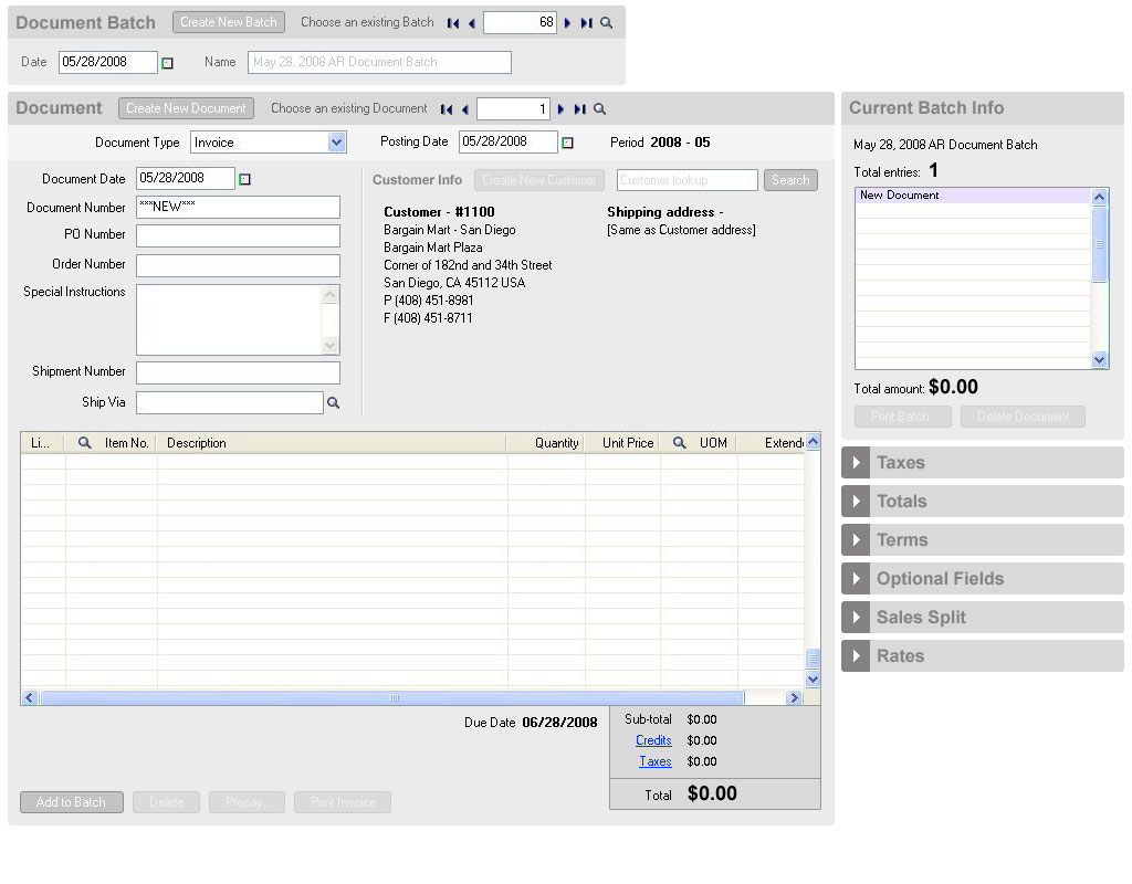
This was one of the later wireframe iterations of that UI design. These tested well in a series of usability evaluations.
It started with grouping form fields together in more reasonable groupings (i.e. put all the address fields together), since the previous UI had form fields arranged in a somewhat scattershot manner. This lead to reorganizing the entire UI. It seems a rather obvious idea, but reorganizing the UI led to studying paper invoice forms to try and reflect the way physical documents are arranged so that there would be a stronger connection between the digital UI and the analog paper forms that data entry clerks were working with.
I worked with another designer to prototype this UI in Visual Studio and worked with researchers to conduct some usability tests and found that even without adding new features, just reorganizing the interface greatly enhanced people's comprehension.
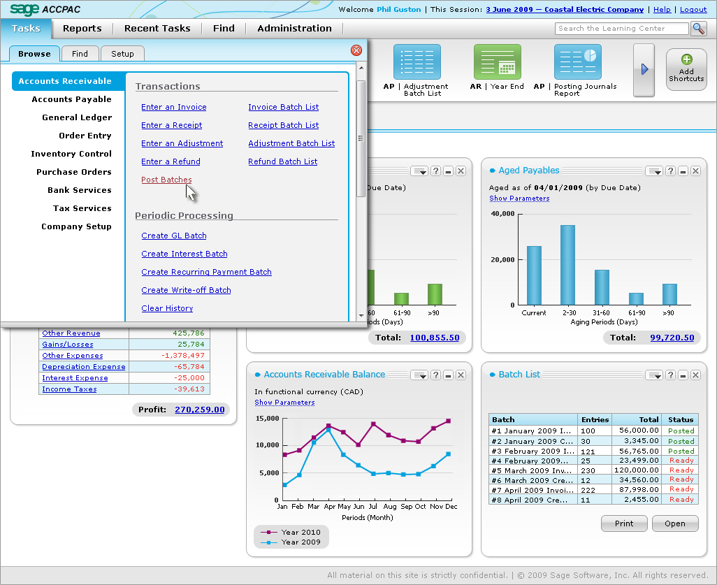
Document Batches
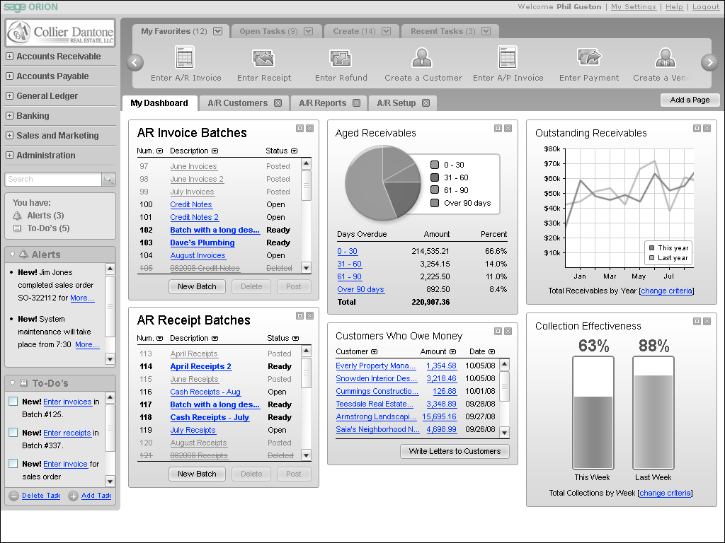
Another problem to tackle was the whole idea of "batches".
In discussing this feature with the business analysts, I learned that batches are a feature unique to Accpac and is targeted at controllers. Batches are a way for controllers to maintain the integrity of the data. Whenever someone enters an invoice, they are collected into batches where controllers can review everything at a later point. Once everything is approved, batches get posted to one of the company ledgers.

-
The main design improvement for the batch UI was to create a visual indication of the status of each batch.
Controllers use this interface to ensure that everything is as it should be and on track for the appropriate fiscal deadlines. The previous interface reported status, but didn't show status, which is a very important distinction. Making it more obvious is a simple way of improving the UI.
In the new design, posted batches could be greyed out since they can no longer be modified (except in rare situations). Open batches (in black) were ones still currently being worked on. Batches marked as "Ready" were ones awaiting review so they can be posted.
I also learned that it's not always easy for controllers to know what's in a batch without actually opening the batch to find out what's inside. So I also designed a batch summary pane (to the right of the list) to be able to provide a bit more information at a glance.
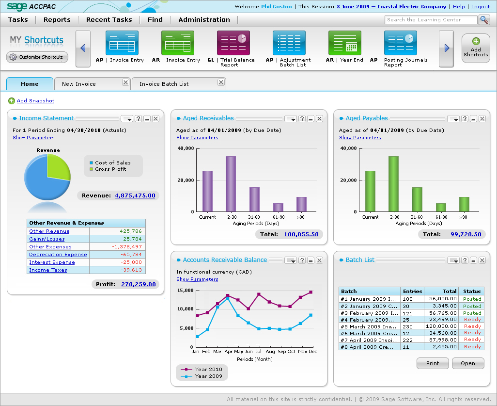
Information Systems
-
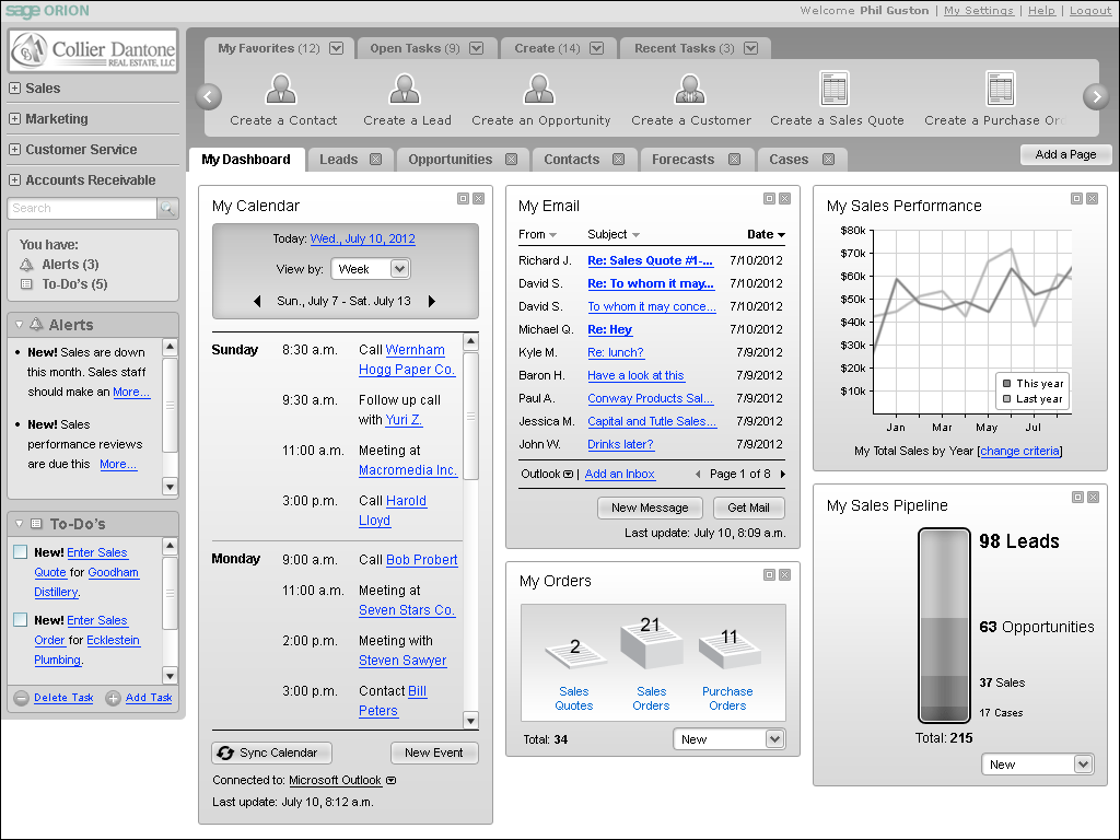
It was important to design a flexible, modular system that had different capabilities for all the various roles.
The next thing to start tackling was the actual information system, the main portal dashboard. The problem to solve was how to represent all the most important accounting information in a simple, single page. I also had to find a way to connect the users to particular tasks and applications that they would use on a regular basis.
The basic idea was to summarize a lot of information in various portlets that appear on the main portal landing page, so that with one view, the user could quickly access everything they need. These portlets would be different depending on your role, and even within roles, the UI could be customized to your own specific preferences. The user could also interact with the portlets to get more information as needed.
There would also be a simple menu system to access the different application UI's, as well as a notification center to see the latest activity within the system. There were a lot of new features that we proposed that were fairly advanced for the time, especially since they weren't included in the original application.
Reporting Tools
-
One of the wireframes I made for a custom reporting tool. Previously, customers had to be able to write SQL scripts (or hire a contractor to do it) in order to generate a report and I wanted people to be able to just look up what they needed.
Later on in the process, I also proposed a different way of generating reports. I had spent so much time thinking about new ways of getting information into the system, and realized there weren't very good ways of getting information back out in a meaningful way. The filtering tools of the time required users to understand a bit of advanced scripting to actually pull data from the database so that they could generate these "reports" on the fly.
Obviously, the non-technical users will not be able to do this on their own. This meant that anyone needing a more custom report would have to get their sys admin involved to help generate the right SQL query. But with better search tools, we could help users generate these kinds of reports without having to write a single line of code.
Numerous rounds of usability testing were conducted to ensure we were heading in the right direction. If we weren't, the test results would help us get in the right direction. In general, I learned a lot from observing the tests. Additionally, with continued iterations on the design, as well as more interactions across the company, I was able to focus the UI concepts in the right way. I worked with a separate team based in Atlanta, to help generate the mockups and visual styling for the new product.
Improving the Visual Designs
Just a quick note: the mockups you're about to see were designed by a wonderful graphic designer who was part of a different team. Working with a remote visual designer on an important aspect of the project was challenging, but an interesting experience as well.
Since the UX team in Atlanta was already familiar with a new UI style being introduced in different products, it was decided that we could work with them to bring that new look & feel to this product. It of course had to be a little different from what they were developing but I thought it would make sense to treat this as a whole family of products with a unified look. It would be a dramatic departure from the standard grey Windows UI toolkit.
-
The overall look and feel.
At this stage, it becomes more about the production and less about the concepts. This is where all the details become very important. The company switched to scrum to be able to handle all the implementation work. There was far too much to do and not really enough time to implement it. So the switch to more agile methodologies made sense. As the lead designer on the project, it was a clear win to have me take on the product owner responsibilities for the main portal.
With these new product owner responsibilities, I worked closely with my scrum team to write up user stories that would help us effectively manage our time. I worked closely with our scrum master to review the team's burndown metrics and participated in a weekly sprint progress meeting with the company management. I even created a physical scrum board that mirrored our digital tools so that everyone could see the visible progress we were making, and also give people the satisfaction of tearing up their story cards at the end of each sprint (morale boosters FTW!).
With the collaboration with my scrum master, we managed to improve our productivity over time so that my scrum team was one of the highest performing scrums in the company!
-
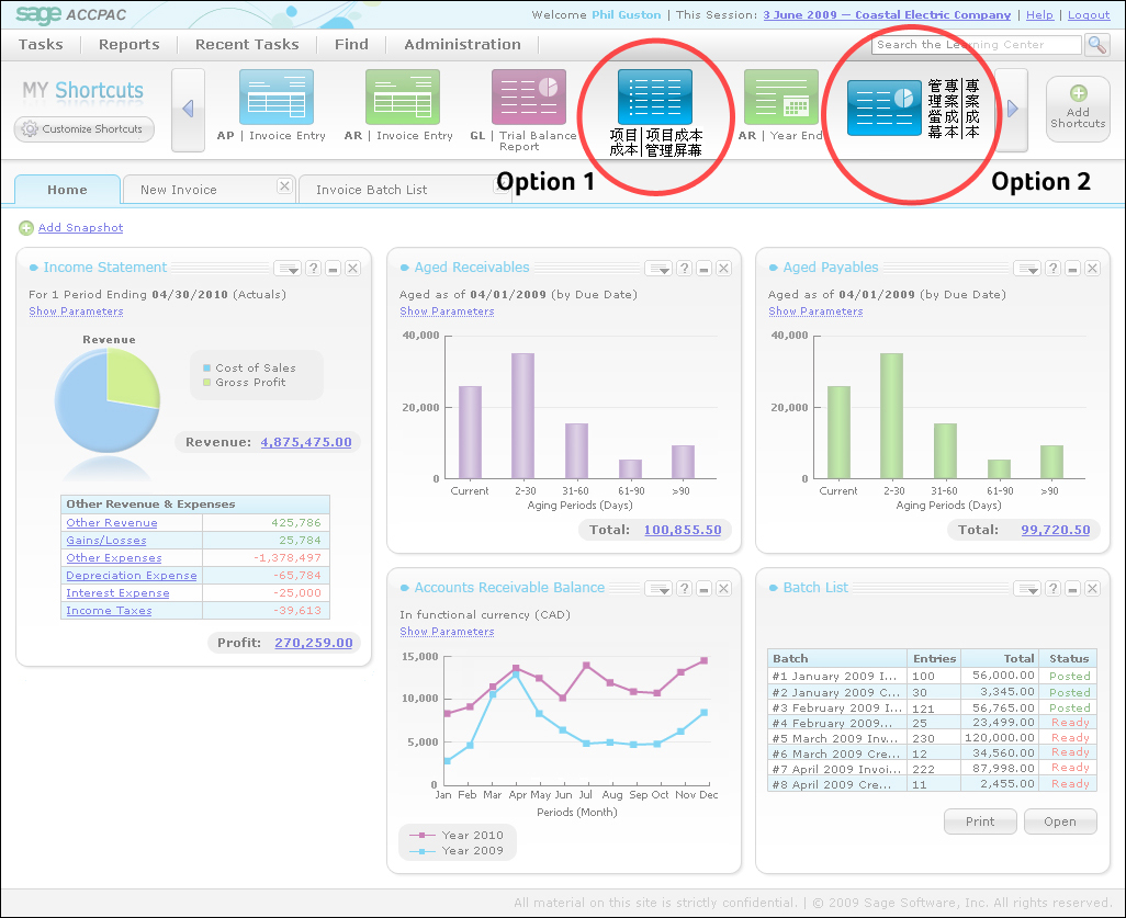
A new architecture for the menu system. The menu options now include action words (verbs) to help the user know what screen they're using. The language we chose was heard often in testing.
-
Because the product was used globally, we had to design for a variety of non-English language situations.
One big accomplishment was flattening the information architecture a little bit. Too often companies (especially enterprise companies) structure software products with deep architectures because while they do a lot of things, their software is often far too complicated to understand. I wanted to flatten it out so that important functions would be easier to discover. I also pushed for renaming some of the simple names. So instead of "Invoice Entry" (which is a noun), I switched the naming convention so that it starts with a verb, e.g. "Enter an invoice". This decision was spurred on by the way our customers actually talk.
Given that this product is not only for the North American market, I also had to work with our remote designers to develop ideas on how to incorporate foreign languages.
Typically, when dealing with Romance languages, the general rule of thumb is to allow for 3x the space as English. For example, if some UI text in English occupied a 2 cm width on the UI, then the Romance languages would need 6 cm to fit nicely in the UI without hyphenation or truncation. In the above bottom image, it shows some different options for displaying Chinese in the UI, which is yet another variation that I had to consider since it doesn't conform to the Romance language rule.
The Outcome
This was a pretty complex project, one of the first major enterprise products that I ever worked on. There was a lot to learn in order to be able to design an effective solution for a new ERP system. But since I focused on following a user-centered process, it was really easy to keep the quality of the work very high. I used usability testing (instead of actual product releases) as a way to "soft release" our products and could quickly iterate and evolve things using test results.
In addition to managing the complexity of the product the company was also transitioning from waterfall to scrum. So learning to do lightweight usability testing as part of design sprints was a huge benefit to the development process. In general it was a really great experience working on this project.