The Customer
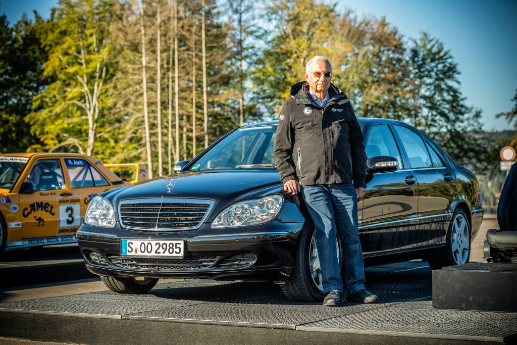
I started by asking for any information about the customer, but unfortunately no one had any research about who would be using the system. People didn't even know which car lines the new system would go into, so there was very little formative information to start on the right foot. Luckily I was able to dig up some research from an older project about S-Class customers (like the man seen above) that I could use to form some basic assumptions. It's not the ideal way to start, but it's better than nothing.
Part of the reason why this is bad is because the people who purchase and drive the S-Class are usually at the upper end of the "premium luxury" scale and not typically representative of the more common type of customer. So it is not a fair assumption to make that the particular preferences and tendencies of this market segment are applicable across all car lines.
On the positive side however is the idea that a lot of fundamental human behavior does not change, and we can use certain learnings from that research to help build a testable thesis for how to proceed.
Problem Discovery
There was only one thing my manager asked me to do:
Create the next-generation voice interface for Mercedes-Benz.
While perfectly fine as a request, when projects are vaguely defined like this, it means that the design work begins with problem framing and problem discovery before digging into solutions.
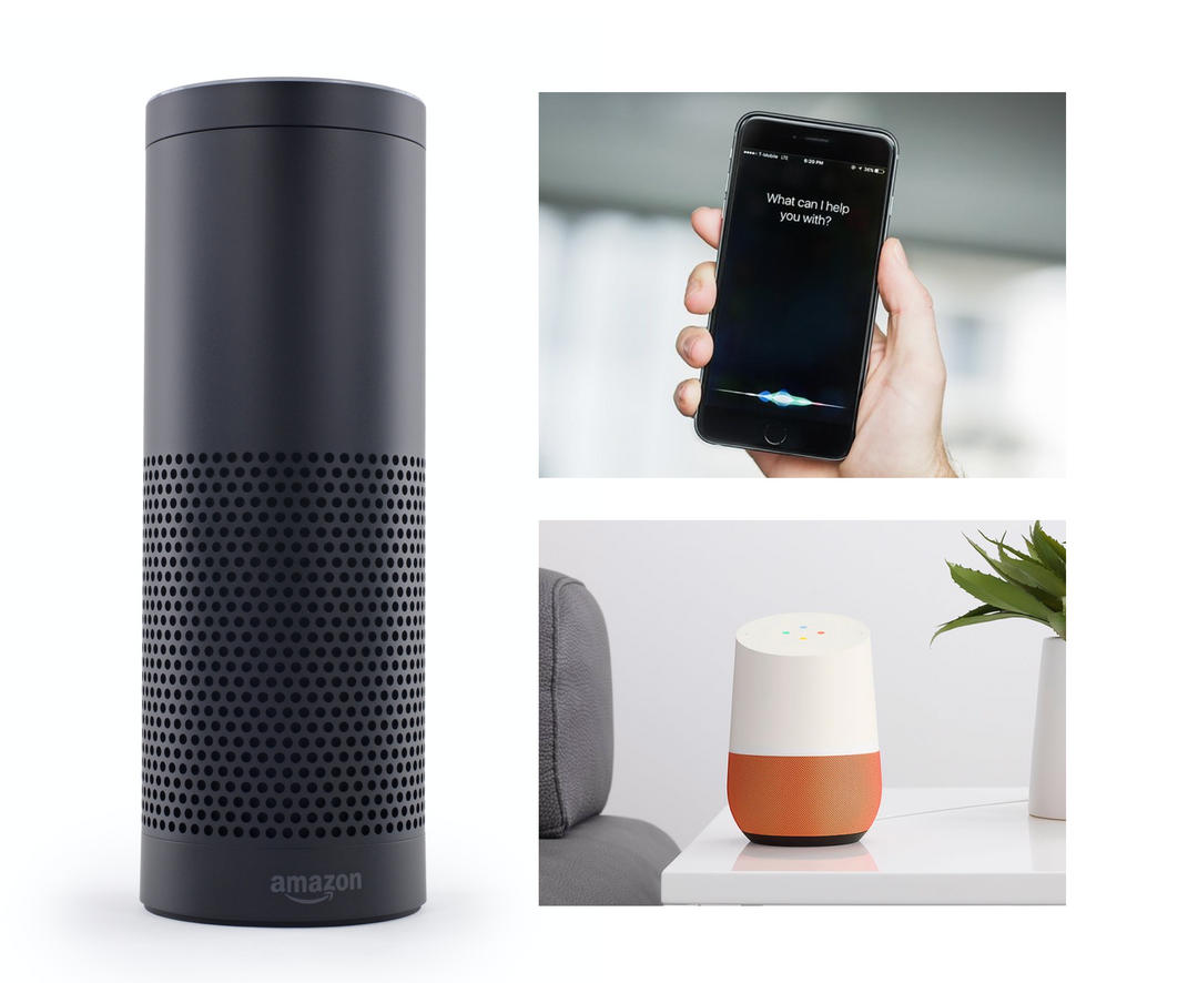
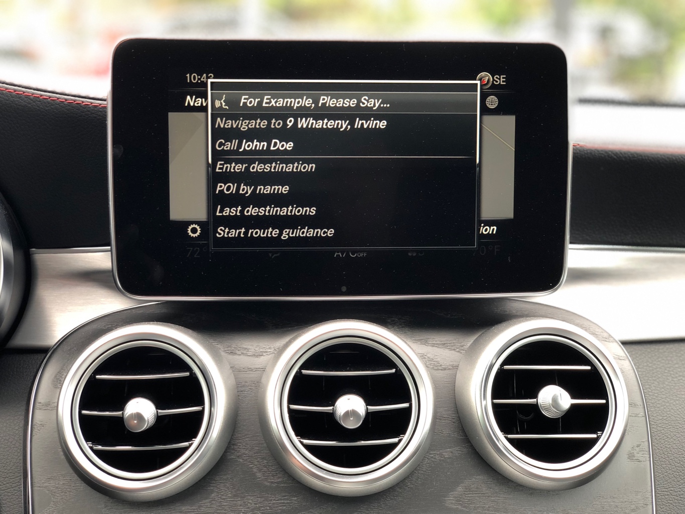
To understand the problem better, I studied different voice interfaces, including previous infotainment systems in older model Mercedes cars. Older generation systems used a text-based interface like in the above image. The core problem with this is that it imposed on the user to read the on-screen text while driving. Reading while driving can be a distracting cognitive task, which is a potential safety issue!
The Solution
The core concept was to reduce cognitive load by making a UI that relies more on recognition, rather than reading and rote memorization.
Minimize the user's memory load by making elements, actions, and options visible. The user should not have to remember information from one part of the interface to another. Information required to use the design (e.g. field labels or menu items) should be visible or easily retrievable when needed.
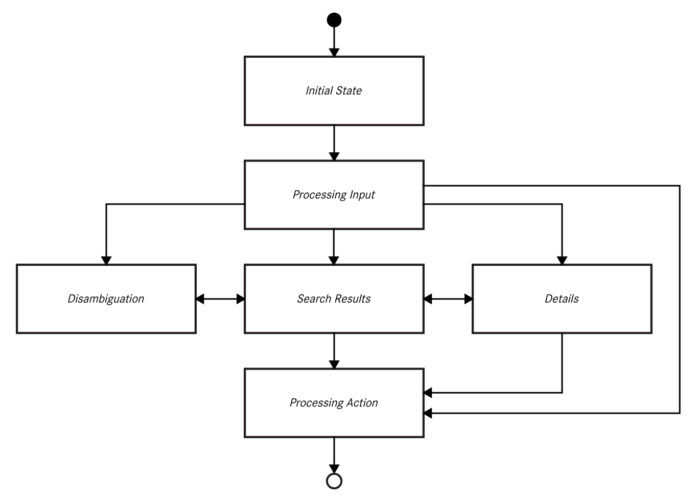
The remaining design tasks focused on creating archetypal interfaces for specific speech domains and use cases to establish a systemic UI concept for voice interaction. Starting with wireframes and iterating with prototypes, I conceived of specific UI views that had useful variations depending on what was needed to support the voice request but with the goal of creating a whole that is fundamentally greater than just the sum of its constituent parts.
Listening States Visualized
Older systems relied only on audible tones to convey when the system was ready for interaction. In testing, we found that people could miss hearing the sounds depending on the situation. So making these state changes more visible and obvious in the new system was a big benefit.

-
The wave line at the top of the screen would gently undulate indicating that the system is ready for input.

-
Once the user starts speaking, the wave line animates in real time based on the mic input volume.
-
When the system detects the user is done speaking, the wave line would twist itself into a lattice like shape and rotate on the horizontal axis to indicate the system is processing the voice input. Then the system would generate a response.
Interface Archetypes
Instead of creating every permutation for every UI instance needed for production, I designed a series of archetypal screens that demonstrated various pieces of functionality. These archetypes were used to build the core functionality of every speech domain and then I worked with developers to iterate on specific details.

-
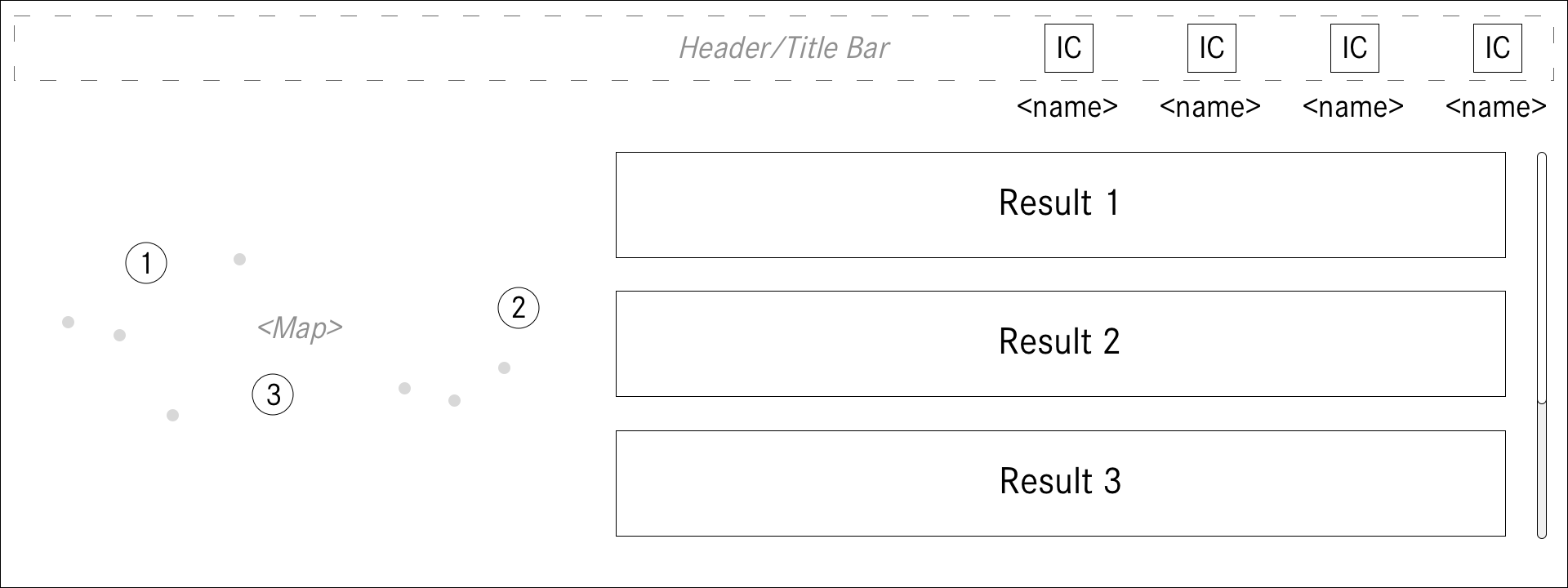
Navigation is obviously a core use case for automobiles. I pushed to integrate maps into the UI which was far more complicated than it sounds. But it was an important feature to include to support the user and provide a better experience.
-
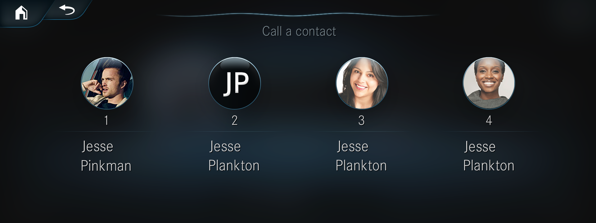
Telephony was another important use case. People often use the infotainment system to safely make phone calls and send messages and making that easier and simpler to do by voice was important.
-
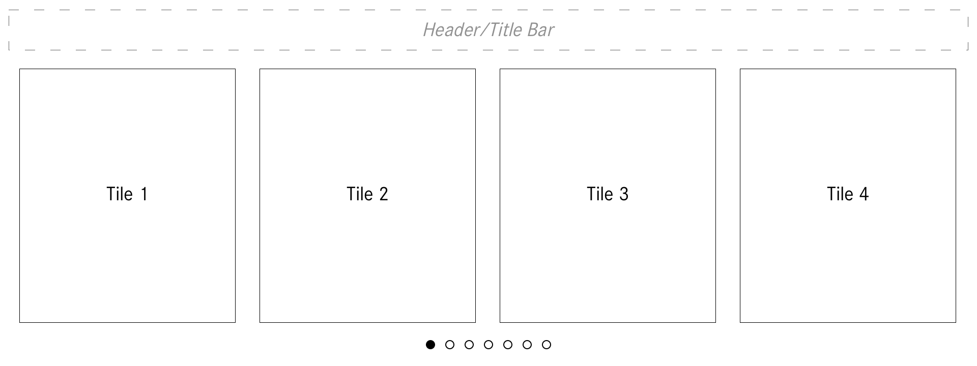
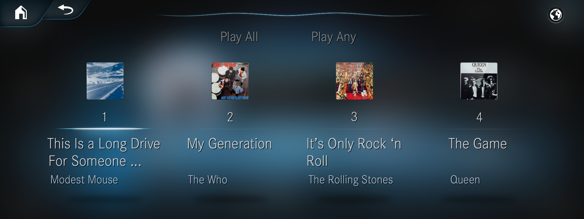
The same horizontal list view was used for many other situations, like here, with music.
-
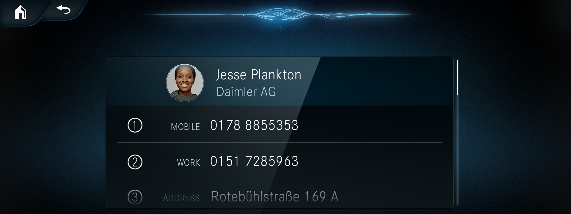
For any given situation, there would always be the possibility to request more information than what was being presented. This information architecture change allowed for a more simple initial presentation and only provided more detailed and complex views when requested by the user.

-
Teleprompters were also still part of the UI, but I designed them to be user assistance features, rather than being the main UI feature as in previous systems. These teleprompters were only available when requested, or if the user hesitated long enough.
The Outcome
There was a lot more to this project than what I put here. I created many UI flows and documented the entire design system for the new voice interface. I worked closely with our engineers who built the widgets and components to ensure they had the proper functionality. Then I collaborated with a variety of different Tier 1 suppliers who built all the screens and application flows for the different voice domains.
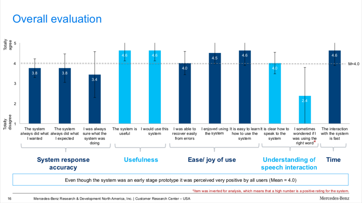
As part of its compliance with GDPR privacy laws, Daimler AG does not really collect analytics about how people use the in-car infotainment system. This made it very difficult in learning how people used the system, but we did conduct many usability tests during the design phase of the project that indicated strong improvements and significant benefits to the user.
I also gave a talk about this project where you can learn a little more about how all of it went!